For my sixth personal project, I wanted to showcase actual work that I have done thus far that is related to broadcast journalism. Within my various classes, I have gotten the opportunity to create news stories. I just recently turned in a news package about young voters in the Black community. This package was chosen to be featured on NWPB’s 2020 election night special, and I was featured as a student journalist and expert on election night earlier this month!
My feature on the NWPB Vote 2020 show.
This news package and live coverage gave me so much experience as a real reporter! This was my first time being on live TV, and I’m extremely proud! My news story was created using Adobe Premiere, and I spent about a week and half preparing for it, and then additional time preparing for the television coverage. I posted this coverage on my LinkedIn, and I will continue to create news stories like this to create a resume reel that I will one day apply for jobs with.
For this documentary analysis, I watched a documentary on Netflix called Human Nature. This documentary, which Netflix defined as a “breakthrough science to the boundaries of morality…spotlights a revelation in genetic modification research known as CRISPR”. The documentary focuses on the discovery of CRISPR, which is a protein that has the ability to modify any gene in the human genome – this could cure genetic diseases and even change people’s eye colors!
Human Nature
Like Presentation Zen (and the assignment instructions) said, documentaries feature narrations, interviews, audio, powerful video, and still images among other things!
In relation to Human Nature, this documentary featured interviews with doctors, researchers and scientists. It also followed along with the stories of people who were impacted by genetic diseases, like sickle cell anemia and albinism (which can greatly impact ones eyesight). These human-focused stories add an element that welcomes a space for empathy from the audience. This weeks class discussion “Week 12 – Consumer Perception” implores us to define empathy, and I defined it as “I define empathy as the ability to feel what others feel. It is the experience of personalizing others experience; stepping into their shoes“. As the audience feels empathy, their connection to the documentary and that people within the documentary increases. More so, the inclusion of professional scientists, doctors and researchers adds the rhetorical appeal of ethos (credibility/authority), as well as logos (logic) from the research cited in the documentary. I learned these rhetorical appeals from last weeks class lecture “Rhetorical Appeals”. These appeals make Human Nature a professional documentary that is able to teach and connect to its audience.
Human Nature also does a great job of using graphics and visual elements to easily show and explain gene technology with viewers. These graphics demonstrate how CRISPR is able to find a gene/piece of DNA and replace it with the correct gene in order to fix a disease. The graphic demonstrations allow viewers to follow along in a way that makes comprehension easier.
This is an example of the Human Nature graphics.
The filmmakers draw viewers (like me!) into the documentary with the use of compelling human-focused stories and graphics that make complicated science talk easy to understand. They are able to tell a story – they demonstrate how CRISPR is able to save lives, and it very well could be the future of all of mankind. They demonstrate a reality, not just science-fiction.
After watching this documentary, I definitely want to include more captivating visual elements that enhance comprehension of my presentation subject. I think that visual elements can add to a presentation by guiding viewers along in a way that encompasses more senses. I want to create a well rounded presentation, and including more visual elements is a great way for me to do so.
Bib.
Michelle Kistler & Corrie Wilder. Rhetorical Appeals. COMSTRAT 476. Washington State University.
Netflix. Human Nature.
Reynolds, G. (2020). Presentation Zen: Simple ideas on presentation design and delivery (3rd Ed.). Berkeley: New Rider.
This week, we analyze rhetorical appeals. By using information provided by the class lecture “Rhetorical Appeals”, we can define rhetorical appeals – these appeals encompass “the ability in each particular case to see the means of persuasion“. These appeals are categorized as ethos (credibility/authority), logos (logic), pathos (emotion), and kairos (timing).
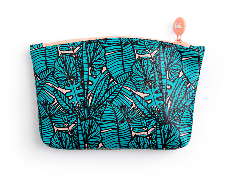
In order to understand my very own interactions with a product or service, I can pay close attention to each rhetorical appeals in relation to my experience with the service Ipsy. Ipsy is a subscription based service that delivers bags of 5 to 6 sample size beauty products (skincare, haircare and makeup) to subscribers on a monthly basis for $12.
The July Ipsy bag
My experience with this service began about a year ago. I was previously a subscriber to Birchbox, which is a similar beauty subscription service. I switched to Ipsy because this service provides an actual bag that consumers get to keep; it’s perfect for storing loose items in a purse or bathroom products while traveling!
To begin using this product, one signs up on their website and fills out a “quiz” that allows the bag to be personalized to their own beauty needs. This quiz serves as a logos appeal, and I think that this is a great aspect to this service because I would expect a beauty service to cater to my own needs. For example, the quiz asks what types of beauty products one prefers (nail polish or lip glosses? beauty tools or skincare?), as well as the subscribers skin type, hair type, and skin color. Once the bag has been completely personalized, the company ships one bag out to each subscriber every month – but not before allowing them to add one product of their very own choice! Ipsy also allows subscribers to choose add on products to joint the mix of the products already included in their bag for a discounted price. Choosing one of my own products in the bag is my favorite feature of Ipsy. It allows me to feel like what I’m paying for is completely worth it; this gratitude appeals to pathos.
The online website promotes the action of buying. Everything is centered around buying the service or individual products; since I’m already a subscriber, I don’t mind this…but it might be intimidating to new visitors, which is another appeal to pathos.
Like I mentioned previously, the packaging is what enticed me with the Ipsy service. The bags are shipped out in pink shipping bags, which I think is really cute! When a consumer opens the shipping bag, the bag of the month is revealed (every subscriber receives the same physical bag with their customized products inside). These bags are so practical and great to receive because they can be repurposed. The practicality of the Ipsy bag is a logos appeal for me personally, as well as ethos because it services as a testimonial as to why I love this product so much.
Using my insights about my experience with Ipsy, I can conclude that Ipsy is a service that provides beauty lovers with an affordable way of trying hair, makeup and skincare products. The process for customizing ones products is as easy as an online quiz, and the customizable ability of the bag ensures that each customer is receiving the products they need and desire. The bag ships right to customers’ front doors, which provides a beauty shopping experience like no other. Overall, the key is that Ipsy provides a large range of high quality beauty products at the right price for any and all customers.
Given this insight, I will now analyze Ipsy’s marketing. If I were to change anything about Ipsy’s product, price, distribution, or promotion, I would change their promotion. I believe that Ipsy excels at their actual product – it’s customizable and curated for each subscribers individual needs, so I don’t think that the product could be any more dynamic. The pricing of the product is only $12, and that provides 5 to 6 sample size products which can last months. I believe that the pricing is fair, and it includes the shipping cost within the $12. In regard to distribution, the service is delivered to ones mailbox, so it is truly able to reach all customers. With promotion, I believe that Ipsy could increase their marketing strategies in order for more people to actually know about the service. Their main competitor is Birchbox who I mentioned I used to be a subscriber of. According to their website, Birchbox is currently having a 2 for 1 special on their beauty boxes. Ipsy never provides promotions like this. Although Ipsy does allow subscribers to add additional (sometimes full size) products to their bag for a discounted price, I believe they have room to do more promotional discounts in order to gather a larger audience. These promotional discounts appeal to all of the rhetorical appeals because it creates a space for clients to be more satisfied and loyal to Ipsy because of the practicality of promotional discounts.
Bib.
Michelle Kistler. Rhetorical Appeals. COMSTRAT 476. Washington State University.
For my fifth personal project, I decided to continue my personal journey of enhancing and creating materials that reflect my work thus far in college and in lifestyle broadcast journalism (once again!). My fifth project is the creation of a website. My website features examples of my most notable published work, an about me section, and a contact section. I created this website with the a goal of adding it to my LinkedIn page that I created for my last personal project in this class. This website is now my main online space where I can direct people if they wish to learn more about me and the work I have done thus far. I am hoping that it will serve as an impressive and refined tool for me as I enter the professional world after college. I created my website using Adobe Portfolio, and it took me about a week to create (two hours per day). I used Adobe Illustrator to create my logo and page covers. I adjusted every aspect of the website from the fonts to the colors. I’m so excited to use this website in the future, and I will tailor it as I move along in my college career!
My candy bar is called Trop Choc, and its slogan is “When tastes of tropical and chocolate collide!”.
Trop Choc is different than any other candy bar on the market right now. It is a solid bar of chocolate filled with mini Skittle-like pieces of fruit flavored candy (similar to the texture of a Crunch bar). Top Choc only comes in one standard size; it’s not produced in smaller sizes because customers should enjoy the full experience every single time. Even the smaller details like the white packaging is something that is unique and usually only used when a candy bar features white chocolate – for Trop Choc, it’s just a part of the style!
Trop Choc is priced at $1.99, which is consistent with the average price of a candy bar in 2020. The delicious fruity chocolate candy bar is sold at participating locations, which includes all gas station and corner stores chains, as well as Walmart, Safeway and Fred Meyer grocery stores.
This is the Instagram advertisement for Trop Choc.
I created Trop Choc with the target audience of 13-17 year olds in mind. The candy bar is youthful, and the use of rainbows in order to represent the tropical flavors will attract the younger audience at mind. I also created Trop Choc with market research in mind. The research concluded that 11% of surveyed kids considered Skittles as their favorite candy. Skittles is famous for their fruit flavored candy, as well as their famous slogan “Taste the rainbow”. I modeled Trop Choc after these two important elements. I decided to include fruit candy and rainbows in my design because it proves to be most popular and well-known. I envision Trop Choc as part of the Skittles brand but separate because it includes chocolate. Trop Choc is the perfect next step for the Skittles brand to expand into the chocolate candy bar market while still staying true to the rainbow. More so, the decision to sell Trop Choc at gas stations/corner stores and grocery stores is based off of the research that states that 44% of kids buy their candy at grocery stores and 23% buy their candy at gas stations/corner stores. Lastly, the market research concluded that kids at each age group between 13 and 17 consistently preferred chocolate over sweet candy, but the results were close. Combining chocolate and sweet candy in Trop Choc provides the best of both worlds!
Bib.
Rainbow colorful prism chromatic, by meneya, Pixabay License
This week in my COM476 class, we are analyzing everything about creative briefs. If you don’t know what a creative brief is, it includes two elements: creative and brief! By using information provided by the class lecture “Creative Briefs & Briefing”, we can define these two very important elements – the creative component means “to inspire copywriters and art directors by channeling their creative efforts toward a strategically sound solution that addresses the client’s brand challenge”, and the brief component means “a short document that provides the creative team with a succinct overview of the most important issues to consider in the development of an advertisement or campaign”.
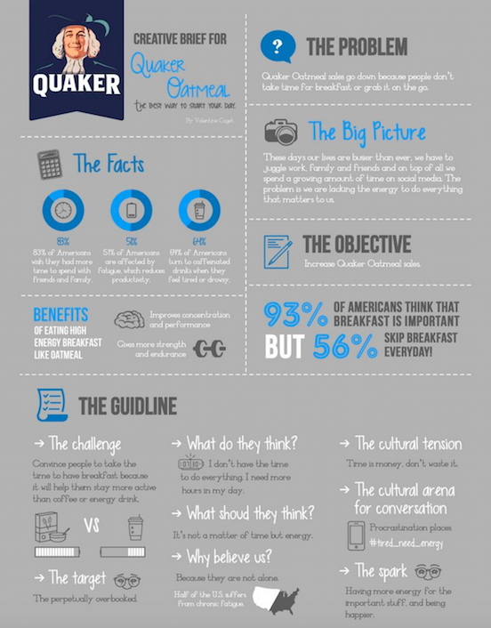
Quaker Creative Brief
In order to apply these definitions, I am going to evaluate the Quaker Oats creative brief. This creative brief includes a problem, objective, guideline, and other important and relevant information.
To begin, lets start with the left side of the brief. The beginning of the creative brief in the top left corner has the brand name, logo, and slogan – “the best way to start your day”. Including these elements is important so that an audience can recognize the brand in the brief. Directly underneath the brand identification section is the facts. This section highlights some key important statistical facts involving sectors that relate to Quaker customers. For example, one of the facts is that 64% of Americans turn to caffeinated drinks when they feel tired or drowsy. This relates to the sector of morning/breakfast that Quaker falls in. Including statistics like this increases the credibility of the brief. The next section includes a small blip about the benefits of eating breakfast, specifically a high energy breakfast like oats.
Moving on to the right side of the brief, the top right corner features a section about the problem – “Quaker Oatmeal sales go down because people don’t take time for breakfast or grab it on the go”. This problem is what this creative brief will try to address and more importantly solve. The section below the problem is the big picture. The big picture essentially takes the problem and connects it to everyday life – we are busy people, and we are lacking energy for important things in life. This is essentially the target audience. The objective follows right below – “Increase Quaker Oatmeal sales”. In other words, this is the main goal! Beneath this section is another small blip about eating breakfast that states that although many Americans think it’s important, they don’t eat breakfast!
The last portion of the brief is the bottom. This section includes the guidelines to a strategic plan to increase sales of the Quaker Oats product. From targeting the perpetually overbooked to take the time to eat breakfast to highlighting the American cultural idea that time is money, this section highlights the company’s reasoning for why they believe customers need to buy their products.
This brief is extremely well organized, aesthetically pleasing, and easy for an audience to read and understand. The class lecture “Creative Briefs & Briefing” also states that briefs should be concise and well defined, which the Quaker Oats brief is! The only thing I would change about this brief is including a distribution plan; how does Quaker plan to implement their ideas and campaign? According to a blog written by Pamela Burp, including a distribution plan section is important because the audience needs to actually see the completed project or campaign. With this suggested added portion, I think the creative brief would be a 10/10!
Bib.
Michelle Kistler. Creative Briefs & Briefing. COMSTRAT 476. Washington State University.
For my fourth personal project, I decided to continue my personal journey of enhancing and creating materials that reflect my work thus far in college and in lifestyle broadcast journalism. My fourth project is the creation of a LinkedIn (finally!). My LinkedIn features all of my professional jobs that I have held so far – Cable 8, The Daily Evergreen, the WSU Office of Presidential Communications intern, CEA study abroad intern, and more. My LinkedIn also features some endorsed skills and awards. My LinkedIn is linked on my interactive networking link-portfolio that I created for my last personal project, as well as my resume. I created my LinkedIn last week using advice from the Murrow career advisor, as well as some Murrow career coaches. I have almost 300 connections so far (which is great because I just started!). Creating my LinkedIn is something that I should’ve done my sophomore year, but I’m very excited that it’s finally done! Having a network like this is really great to have as I prepare to graduate in the spring. I have started to connect with professionals in the workforce, and I am going to use my LinkedIn in the future to expand my network!
My personal creative process is something that I would describe in these three words: natural, freeing, and precise. For my entire life, I have expressed my creativity through many outlets, such as dance, art, acting, signing, and much more. My creativity is something that has grown in age with me, and it lives in me as naturally as my own skeleton. In Chapter 1 of The Creative Habit by Twyla Tharp, Tharp describes creativity for some as “over time, as the daily routines become second nature, discipline morphs into habit”. That is my own creative process; one that has morphed into something that I do not even give thought about anymore – it is completely second nature.
When I look at a blank page with a blinking cursor (or an empty room), I do not feel intimidated or overwhelmed. Even if I am dealing with something that I’m not familiar with, I still feel okay and equipped with knowledge to tackle any task. I look at a blank page as an opportunity for something great. I have high expectations for myself, and whenever I’m starting something new, I feel inspired and motivated.
But sometimes in my creative process, I do struggle. Although I am always inspired to create something that I am proud of, I often struggle with turning the motivation into habit. Starting a project is no problem (and the finish line is just as sweet), but there are times when the motivation that greeted me at the beginning waivers in the middle. In these times, I have to rely on habit and self-discipline instead of motivation. Tharp also says “creativity is a habit, and the best creativity is a result of good work habits”; I consider my creative process habit because I can rely on it when my motivation falters.
An article called “What does it mean to be creative?” by Lucy King exemplifies the struggle of the creative process. King says “Most creative folks I know struggle with process. They are incredibly hard on themselves. They wonder if their work is good enough? Will they be able to salvage something from the train wreck they imagine they have created?”. This self doubt is something that also hinders my creative process. Like I mentioned above, I have high expectations for myself. These expectations create great work, but they can also hinder me. In times when I doubt myself, I rely on my creative process and natural instincts to carry me through to the end.
My creative process heavily relies on habit and self-discipline. Creativity has been with me since birth, and it has been developed even further through all of the things I have done in my life. Even when my motivation falters, I can always find a way to keep my creativity flowing. Creativity is something that comes naturally to some, and to others, it is a skill that must be developed and nurtured; but either way, it lives in all of us.
Bib.
Tharp, T., & Reiter, M. (2006). The creative habit: Learn it and use it for life. Simon & Schuster.
I decided to continue my personal project journey of revamping and enhancing materials that reflect my work thus far in lifestyle broadcast journalism. My third project is an interactive networking link-portfolio that features my resume, links to published work, and links to notable scholarships/awards from the past two years. I created this link-portfolio to send it to individuals that I have networking meetings with before the actual meeting, allowing them to browse information about me. I actually just had a networking meeting with three reporters, and I sent this link to them the day before. I instructed them to feel free to take a look to become more familiar with my background before the meeting! I created this on October 2nd, 2020 using Carrd. Creating this project taught me that it is important to have resources link this in my “arsenal” to use when I have future opportunities pertaining to my career. I am going to use this link-portfolio whenever I have a networking meeting in the future!
For my second personal project, I decided to both completely update my resume and create a more simplistic and refined version of my resume. I wanted to create both of these new and improved resumes as they represent me and the work I have done thus far in college. My resume represents my current passion for starting a lifestyle career, and I wanted to create two new resumes that I am completely satisfied with. I created my first, more detailed resume on Microsoft Word, and I created my simplistic resume on Canva. These resumes will be the ones I use from this point on.